The Minimalist Aesthetic4/11/2011 Mies van der rohe's famous quote, "less is more" has intrigued architects for most of the 20th century and he is considered a foremost proponent of the minimalist design approach. Although there was a flirting with post-modern longings for historical reference, the minimalist aesthetic is a strong as ever today. 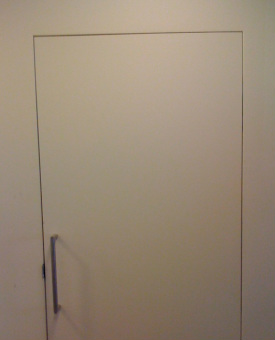 Minimalist Door Detail Although less is visible, it takes more time to detail and skilled craftsmanship to deliver a superior product. I tried this minimalist approach recently on a project on Telegraph Hill in San Francisco. When you look at this photo of the trimless flush installed door, what you see is not just the plane of the wall and door, but suddenly the joint separating the wall and door presents itself. In this case it is straight, parallel, and crisp. I wouldn't have attempted this without the help of a master craftsman - Kenji. I'm thrilled with the result and so is my client.  Kenji san Kenji is from Japan and is a master Japanese carpenter and furniture builder. His work is second to none. Thanks Kenji.
0 Comments
Balance the Light4/9/2011 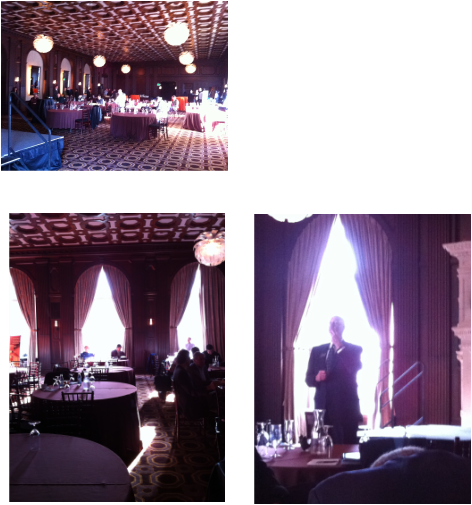 The Julia Morgan Ballroom 465 California Street, San Francisco Light has been a fascinating topic ever since I took Dick Peters architecture class at UC Berkeley -- we built light boxes with moveable openings and shifted the "sun" around the "building" to study the different effects of light. No computer simulation then! Balancing the light is almost always a good idea, particularly when visual clarity is important. I've been in the Julia Morgan Ballroom at least two times before. As I entered for the third time, I immediately remembered the problem of lighting a space like this. It's large and ornately detailed with dark paneling - heavily draped windows on the south and west. In the top photo, notice the very strong natural light from the south facing windows producing blinding spots of light. In the ballroom above, there is no balancing natural light from the north side and an insignificant amount on the west side. The artificial lighting is too meager to compensate for the cavernous dark interiors. See how the speaker is backlit and it's almost impossible to see his face. I wonder if this is how Ms. Julia Morgan originally designed the space? It's nice to think that perhaps the arches on the north side of the space were once windows. 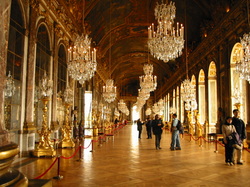 Hall of Mirrors - Palace of Versailles This problem was luxuriously solved over 300 years ago in the Hall of Mirrors at Versailles. Large arched mirrors were installed equal and opposite to the wall of windows. I guess Louis XIV had a good architect (Jules Hardouin-Mansart).
AuthorThe Ahn-Mock Family blog. Feel free to comment. ArchivesCategories
All
|
 RSS Feed
